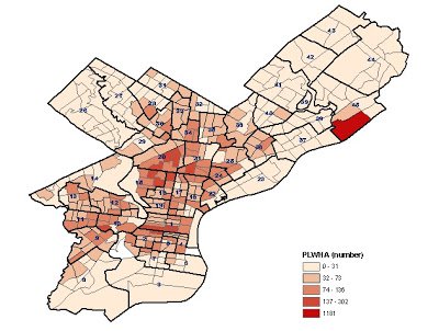
Map of Philadelphia HIV/AIDS Epidemic
by Office of HIV Planning
by Office of HIV Planning
May 8, 2012
The map shows the number of HIV cases by census tract (division of population used by the US Census Bureau). This map is a part of the 2011 geographical risk analysis, which examined what community factors (crime, death rates, income, etc.) were associated with areas of high concentration of HIV/AIDS. This analysis was done to determine where HIV prevention and care services are most needed. An explanation follows the map.

Based on our analysis, high risk census tracts in Philadelphia are, therefore, predominately unstable, high crime, and low socio-economic status (SES) areas of the city. Sixty-six census tracts in Philadelphia, or 17% of all tracts, are identified as high risk and high PLWHA areas, and ten census tracts are identified as very high risk with correspondingly high PLWHA rates.
The neighborhood which contains the highest number of these tracts, and so is considered at the highest risk in the City, is Sharswood-Stanton in Lower North Philadelphia. This is followed by Millcreek-Parkside, Strawberry Mansion, Poplar-Temple, Nicetown-Tioga and Hunting Park-Fairhill.
There are, however, a number of census tracts that do not follow the general patterns found; some areas may have low rates of people living with HIV/AIDS (PLWHA) while they appear to be areas of high risk, while others may have high PLWHA rates in otherwise fairly low risk areas of the city. Areas with high PLWHA and low risk are usually characterized by middle to upper-level socio-economic status with fewer Black residents, lower crime and relatively stable census tracts. Most of these areas are near, or in, Center City. Factors unique to Center City make this area an outlier in terms of the risk analysis, while characterized with a high rate of PLWHA.
Areas with low rates of PLWHA but very high risk indicators include areas within Paschall-Kingsessing, Upper-Kensington and Haddington-Overbrook neighborhoods. These tracts have very high risk levels, but lower PLWHA rates than other tracts with the same risk levels. This analysis could not determine any neighborhood-level protective factors that contributed to lower rates of PLWHA but perhaps future research might provide some insight.
So what do you think?
Why do you think the map looks like it does? Why is HIV concentrated in high risk communities? Why is Center City unusual, in that there are high rates of people living with HIV/AIDS but the census tracts are considered ‘low risk’? Does the map match your experiences or observations?
We want to hear from you. Share your knowledge and experiences to give context and meaning to this map.
This website is supported by the Health Resources and Services Administration (HRSA) of the U.S. Department of Health and Human Services (HHS) as part of an award totaling $20,808,001. The contents are those of the author(s) and do not necessarily represent the official views of, nor an endorsement, by HRSA, HHS, or the U.S. Government. For more information, please visit HRSA.gov.